Example Variables(Open Data):
The Fennema-Sherman Mathematics Attitude Scales (FSMAS) are among the most popular instruments used in studies of
attitudes toward mathematics. FSMAS contains 36 items. Also, scales of FSMAS have Confidence, Effectance Motivation,
and Anxiety. The sample includes 425 teachers who answered all 36 items. In addition, other characteristics of teachers,
such as their age, are included in the data.
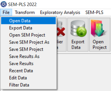
You can select your data as follows:
1-File
2-Open data
(See Open Data)
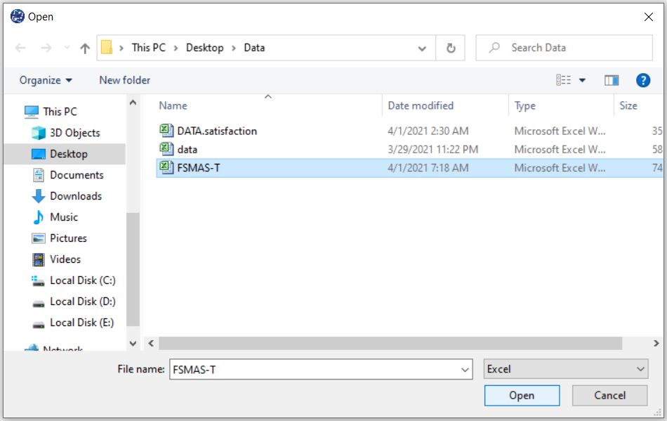
The data is stored under the name FSMAS-T(You can download this data from
here ).
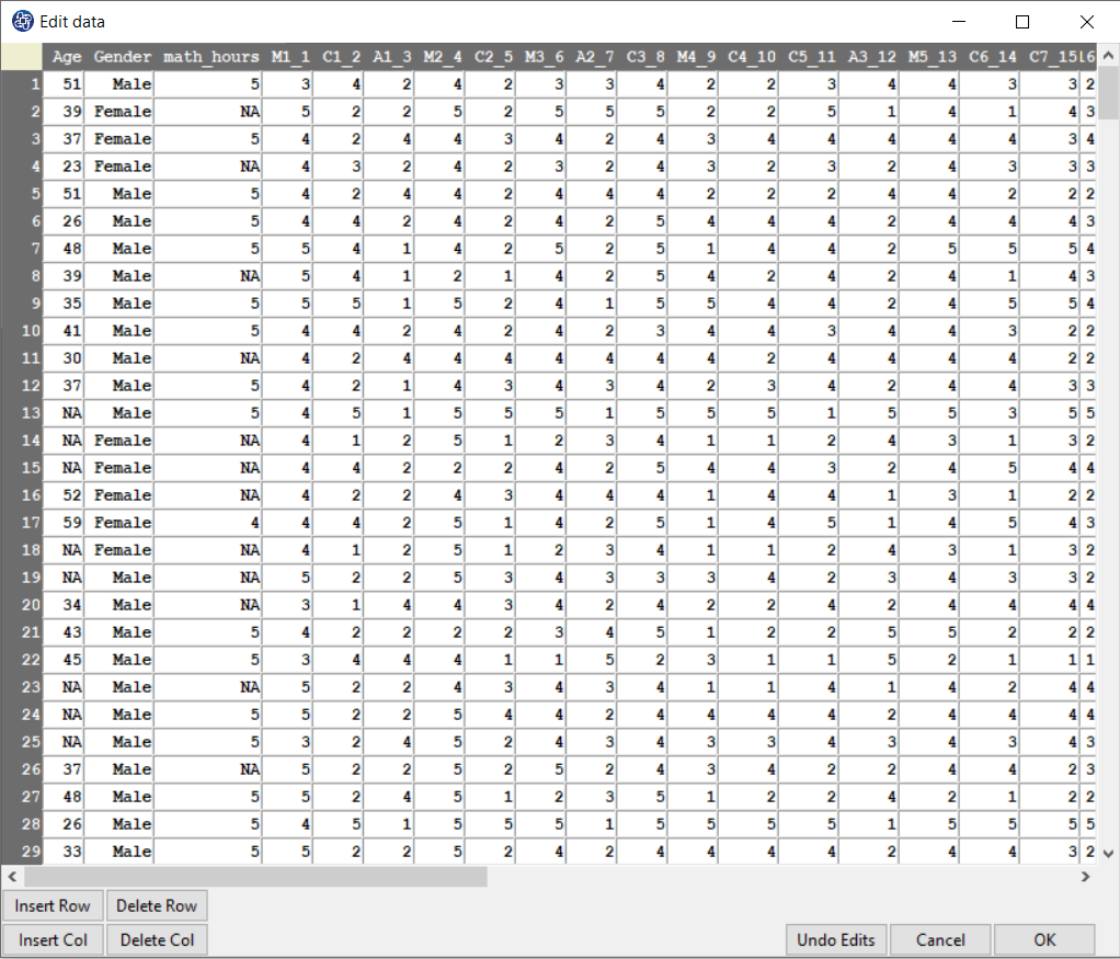
You can edit the imported data via the following path:
1-File
2-Edit Data
(See Edit Data)
Example Variables(Compute Variable):
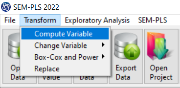
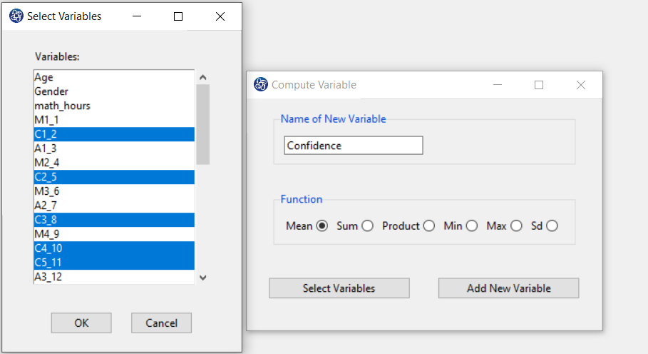
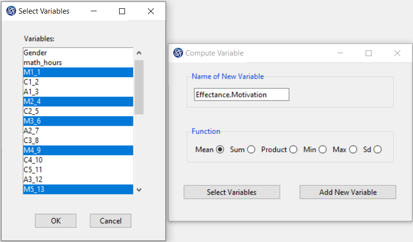
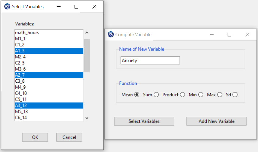
The three variables of Confidence, Effectance Motivation, and Anxiety can be calculated through the following path:
1-Transform
2-Compute Variable
Items starting with the letters C, M, and A are related to the variables Confidence, Effectance Motivation, and Anxiety, respectively.
(See Compute Variable)
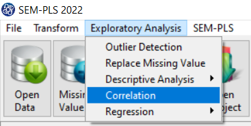
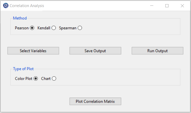
A. Path of Correlation Analysis:
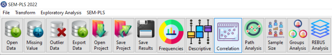
You can perform correlation analysis by the following path or “correlation” button:
1-Exploratory Analysis
2-Correlation
B1. Method:
You can choose one of the following methods:
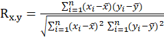
*Pearson: Consider the random sample
 , ... ,
 This correlation coefficient is obtained from the following equation:
 .
.
 and
and
 are the individual sample points indexed with i
 : sample means
 : sample size
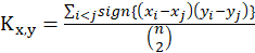
*Kendall: Consider the random sample
, ... ,
This correlation coefficient is obtained from the following equation:
and
are the individual sample points indexed with i
: sample means
*Spearman: Consider the random sample
, ... ,
This correlation coefficient is obtained from the following equation:
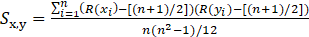
and
are the individual sample points indexed with i
R(
): the rank of
among

R(
) : the rank of
among

: sample means
B2. Type of Plot:
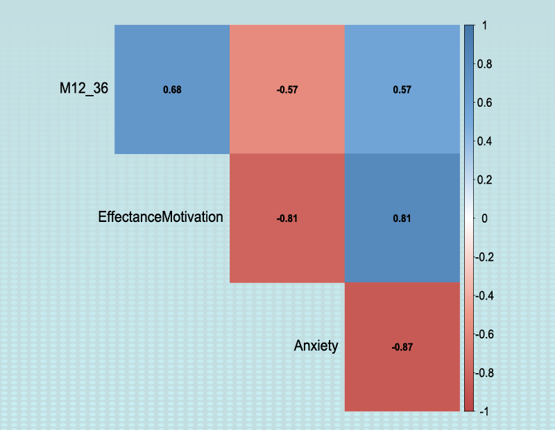
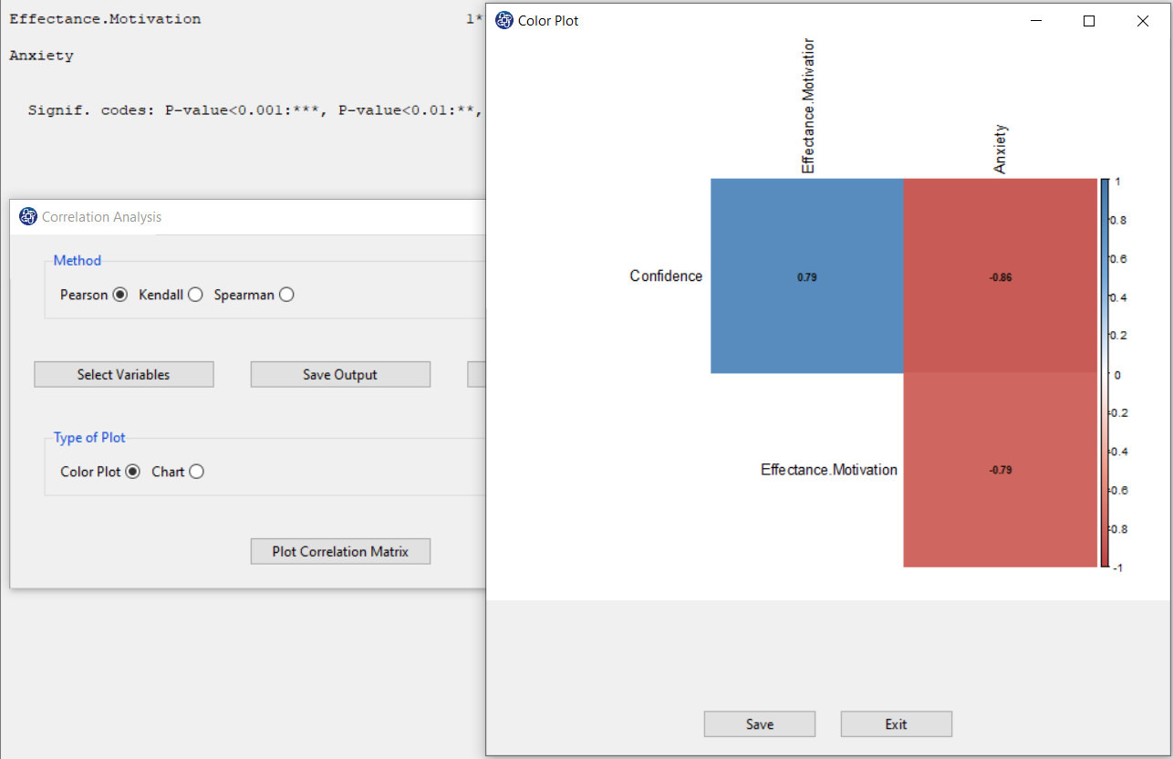
You can choose one of the following two plots to better understand the relationship between the variables:*Color Plot: This plot shows the value of the correlation between the two variables by color separation. The more the color tends to be white, the weaker relationship between the two variables. The more the color tends to be red, the stronger (negative) relationship between the two variables. The more the color tends to be blue, the stronger (positive) relationship between the two variables.
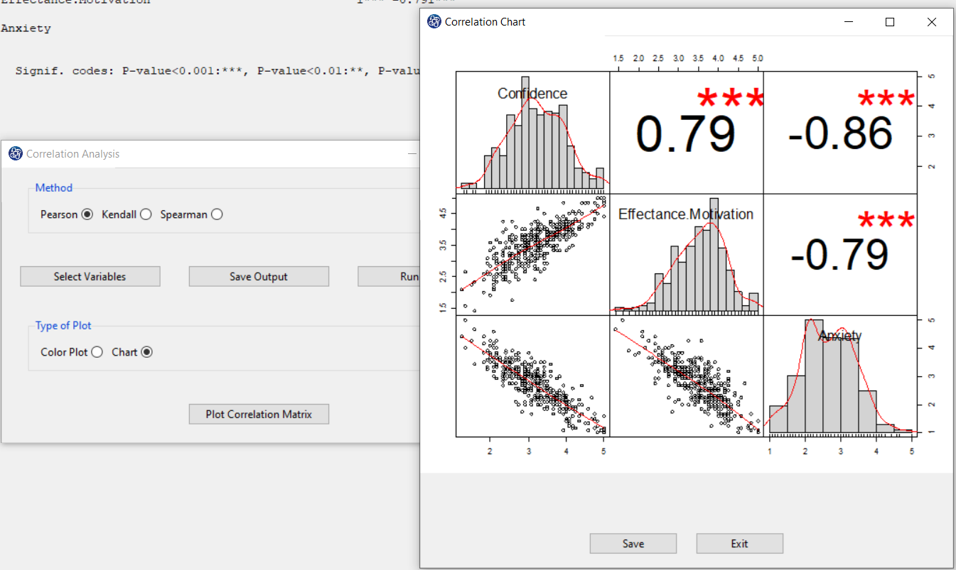
*Chart: This chart shows the correlation coefficient between each pair of variables, the histogram of variables, and the scatter plot of between each pair of variables.
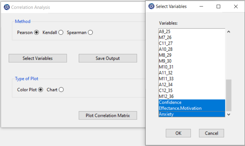
C. Select Variables:
You can use this button to select the variables for correlation analysis.
For example, you can select three variables, Confidence, Effectance.Motivation, and Anxiety.
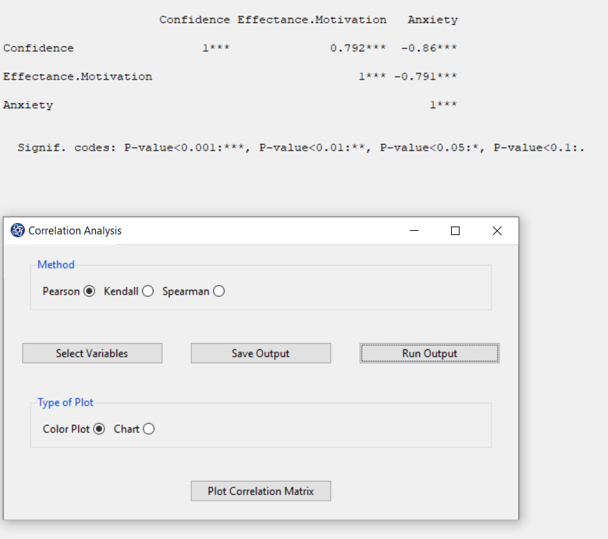
D. Run Output:
You can see the results of the correlation matrix in the main software window by clicking this button. In this matrix, the significance of the relationship between the variables is specified by code. For example, if the P-value of the correlation test is less than 0.001, it will be denoted by ***. As can be seen, for the three variables Confidence, Effectance.Motivation, and Anxiety, the relationship between the variables is significant and the P-value of the correlation test is less than 0.001. Also, the results show that Anxiety has a negative relationship with Confidence and Effectance.Motivation.
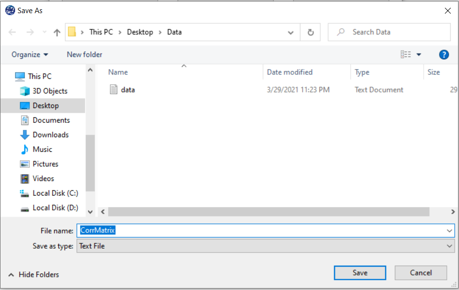
E. Save Output:
By clicking this button, you can save the correlation analysis results. After opening the save results window, you can save the results in “text” or “Microsoft Word” format.
F1. Plot Correlation Matrix(Color Plot):
You can click on Plot Correlation Matrix after selecting one of the Color Plot or Chart options in Type of Plot.
For example, Color Plot shows that Anxiety has a negative relationship with Confidence and Effectance.Motivation.
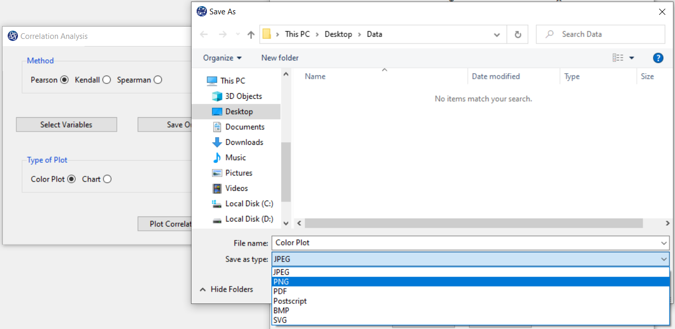
F2. Save plot:
You can save the plot by clicking the Save button in one of the following formats:
-JPEG
-PNG
-PDF
-Postscript
-BMP
-SVG
F3. Plot Correlation Matrix(Chart):
By selecting the chart option in Type of Plot and clicking on Plot Correlation Matrix, you will have a matrix plot. For example, Correlation Chart shows that the relationship between the variables is significant, and the P-value of the correlation test is less than 0.001. The scatter plot shows that Anxiety has a strong and negative relationship with Confidence and Effectance.Motivation.